How we built a space where every second should be precise and it matters
This is the story how how we came across building the next generation of On Call Schedule editor for Zenduty and how i failed a bet with Shyam and played cricket for 1 month
Managing an on-call schedule can be a challenging task, especially for larger organisations with multiple departments and complex call rotations.

Chapter one
What and Why of an OnCall manager ?
One of our clients, a major fintech company in India followed a shift of once 8 weeks, So one user will be oncall for a week and after that they come back after 7 weeks again, Also they used a buddy system where a partner is assigneed with the Oncall engineer for any help, Robin for the Batman

So team managers create oncall rotation for their users to come up on their shifts during a specific interval
An on-call schedule manager can streamline this process and help ensure that the right person is always available to respond to critical incidents.
Chapter two
How we decided to redesign our existing interface
Nobody can know our customers better other than customer success teams. Anjana was heading our Customer success team at that time and we started seeing patterns of confusion in terms of Usability, Navigation and Error handling in schedules
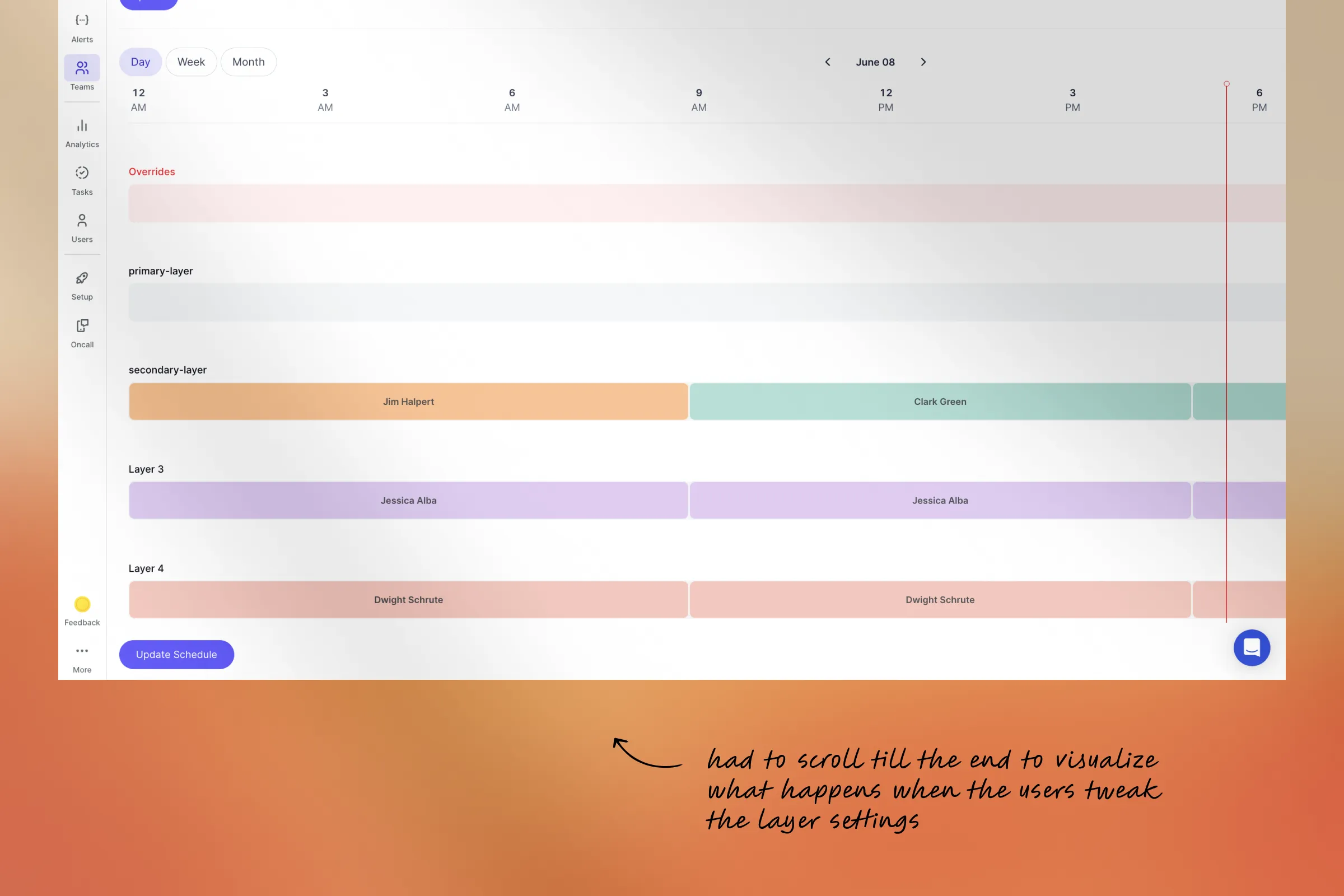
You can scroll to the and verify the changes you made looking into the schedule preview
Ohhh.. I didn't know there was a preview down there
Said by some people when they came to us to figure out why they were not getting alerts in the first place


Insights from the conversations to customer support team made us draw the first draft of ideations. It made us create benchmarks about things to improve.
Chapter Three
We needed some work in navigation
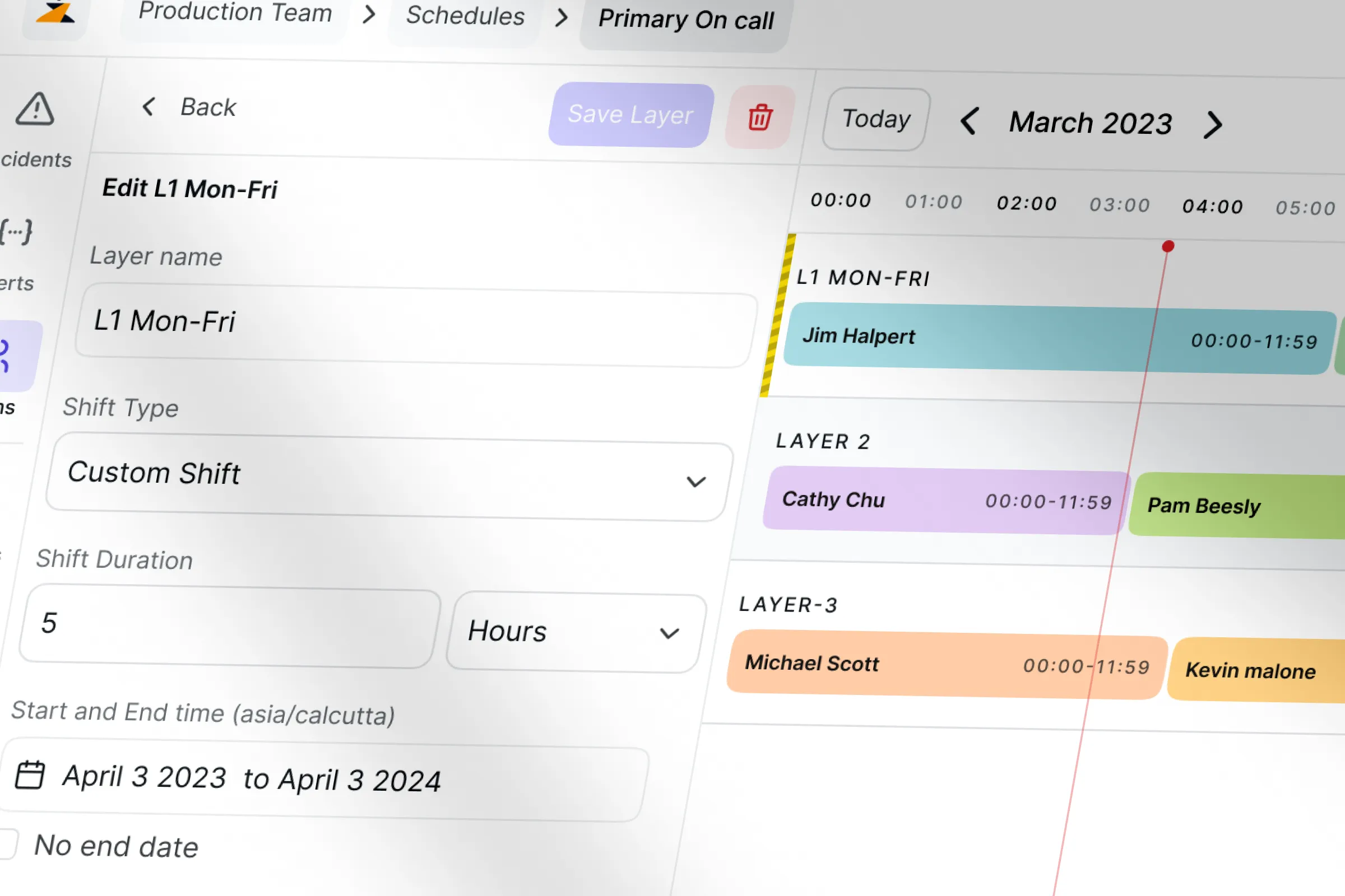
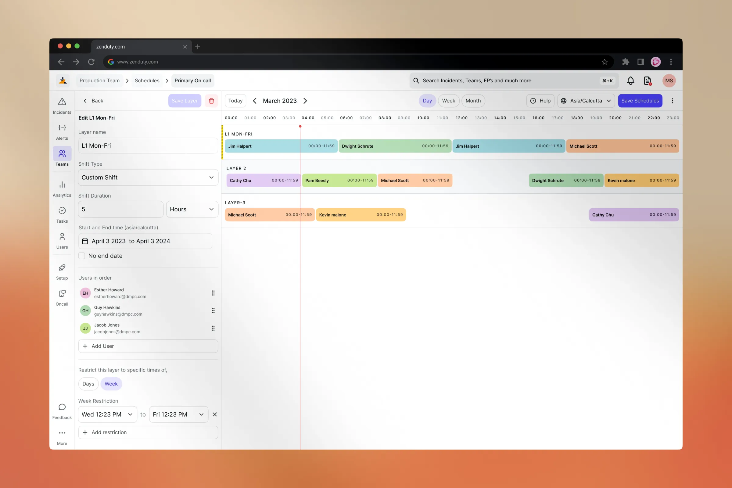
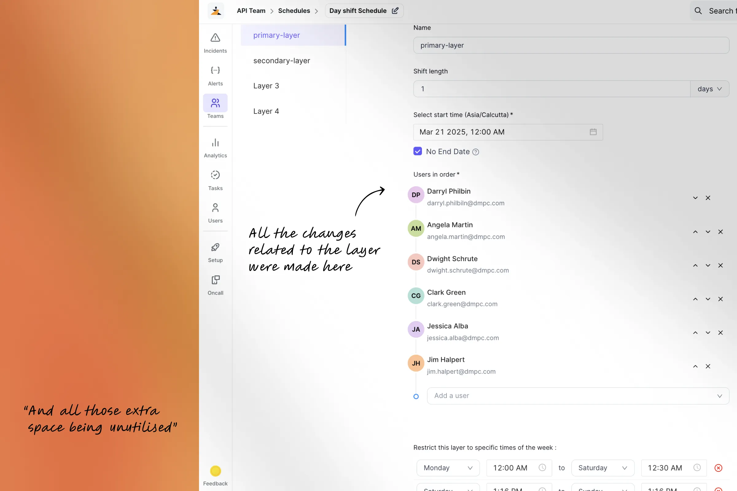
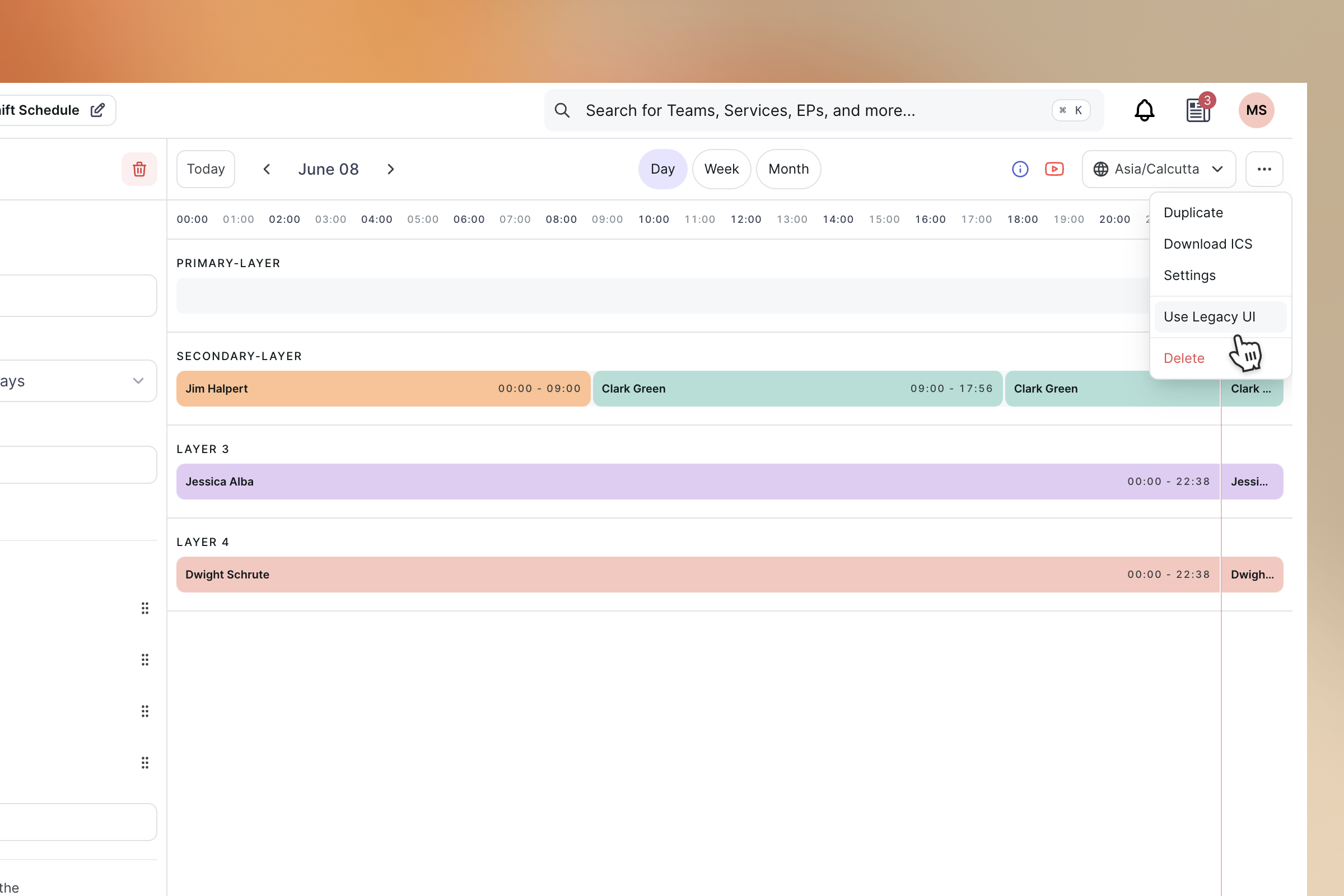
Schedules are broken down further into layers, they give more precise control over on-call schedules. Schedules can be set for each day, every week, or in a way that suits your team.
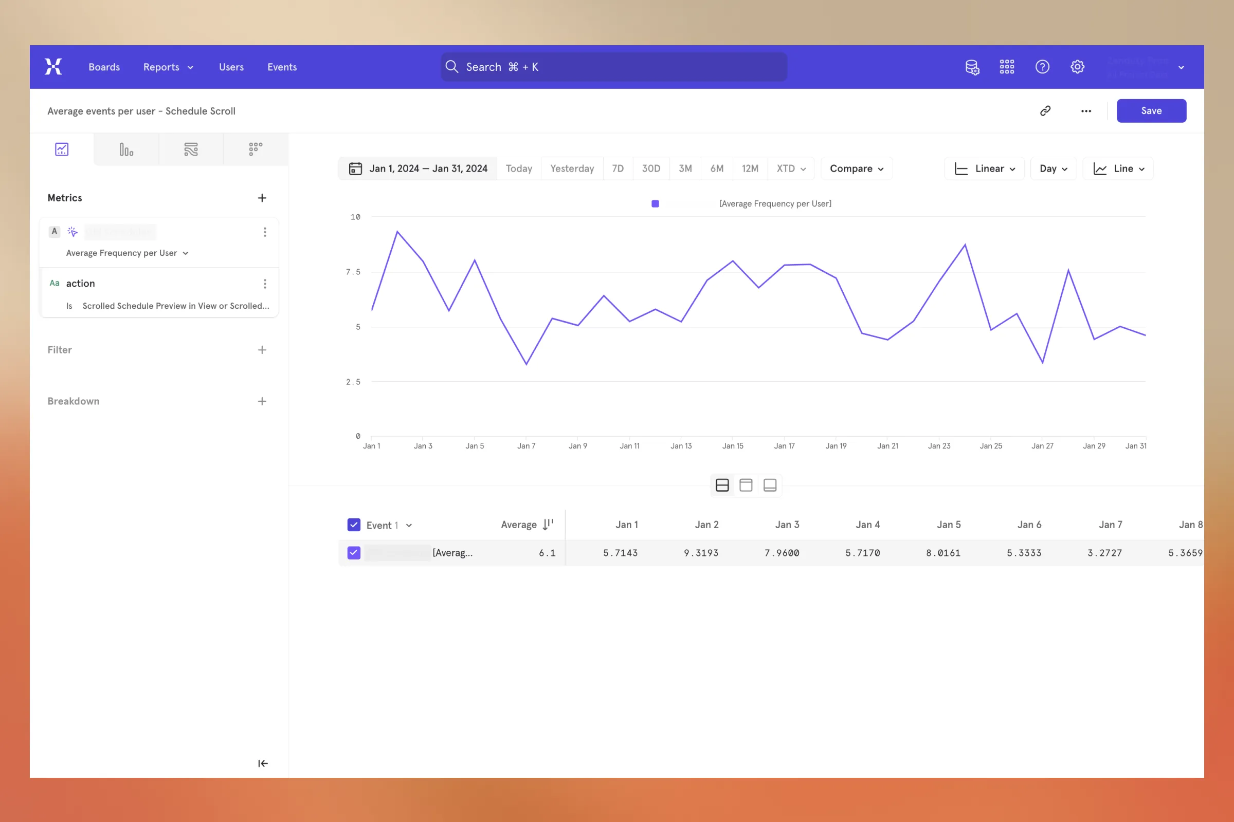
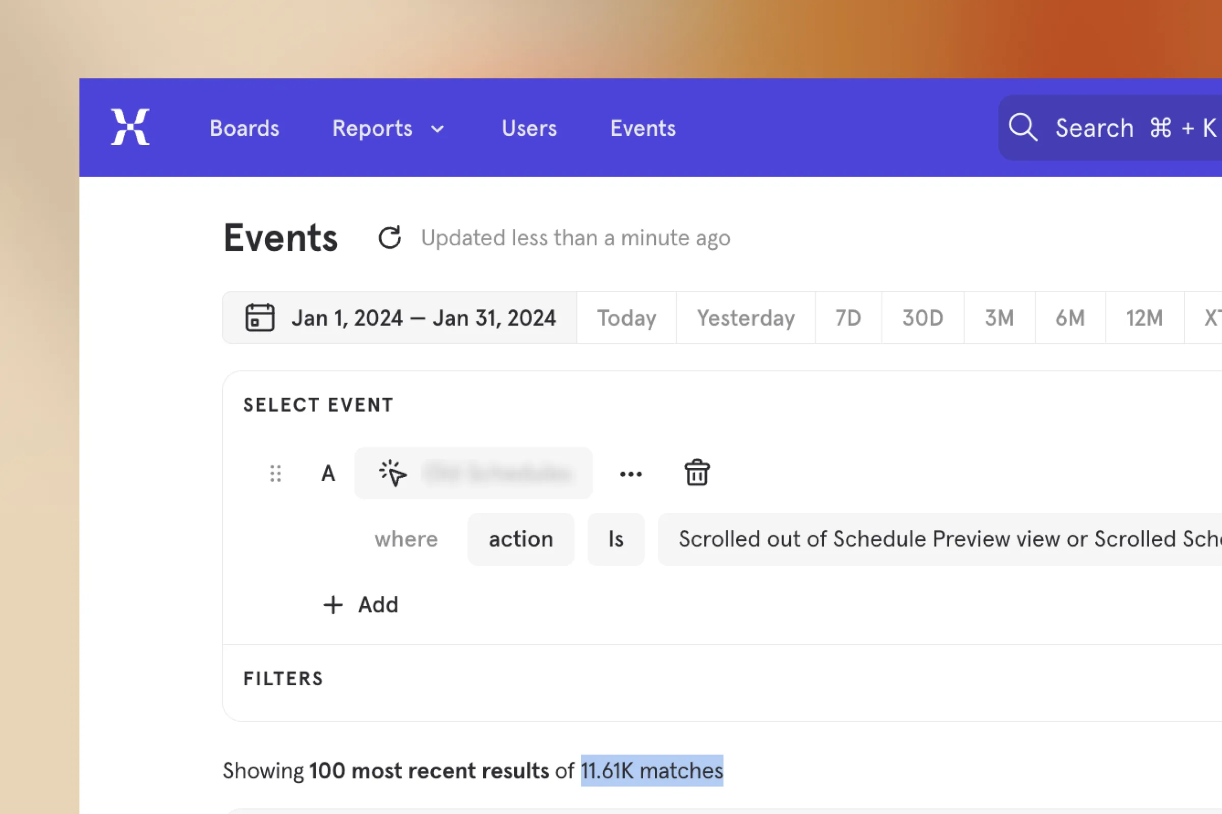
While we tracked the user behaviour through event and scroll tracking we found that on an average a user triggered 6 scroll events to see the changes they make in the layers and also some users were unaware of the preview as they made changes and even without seeing how it reflected in the timeline they proceeded to saving

This was creating two negative results
- More effort to visualise and understand changes
- Increased rate in error because of un accessible preview

Chapter four
Error handling
Another category in term of support tickets were inaccurate schedule data. We used to see confusion in terms of things appearing on the preview because we failed to handle the errors and edge cases


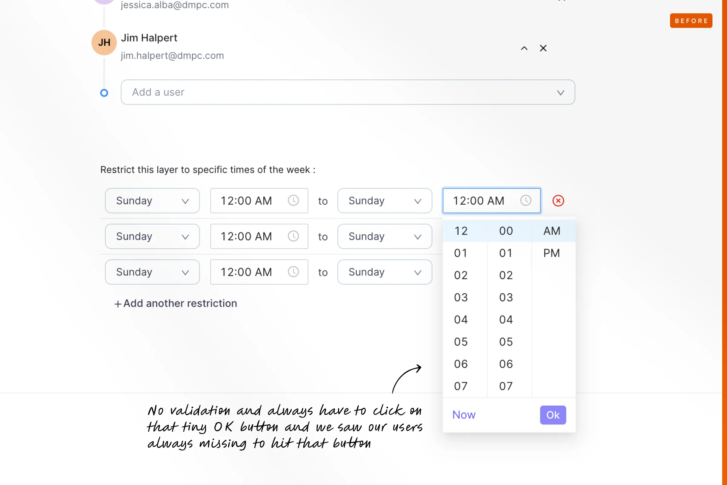
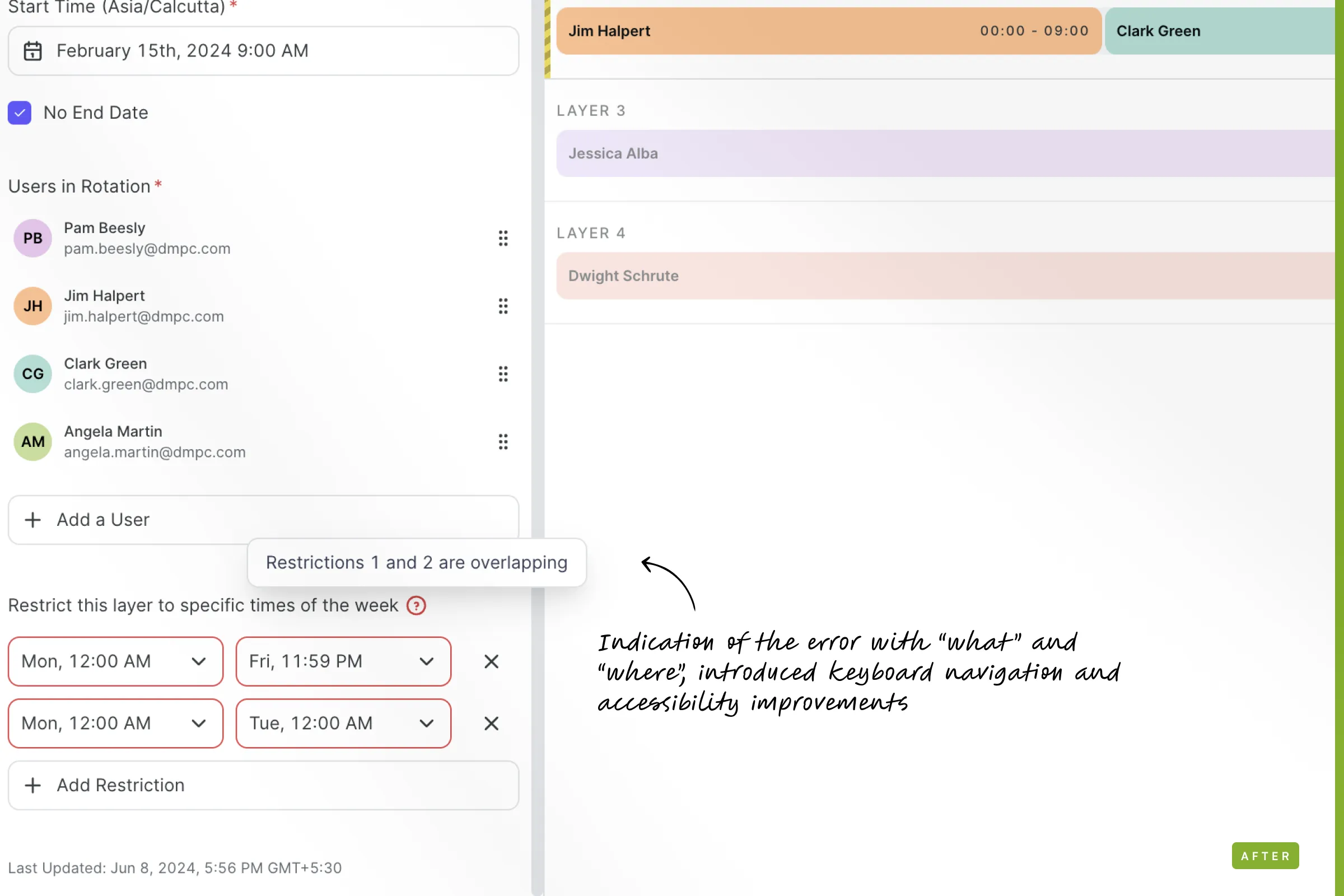
For example in one layer there can be 2 or more restrictions in a single layer, If both restriction overlaps it creates incorrect data. An accessible date picker to create the restriction is extremely necessary and basic ! but the bigger picture happens when we let the user know that they made an error and its exactly here and its precisely this.
Chapter five
Coverage and Connections
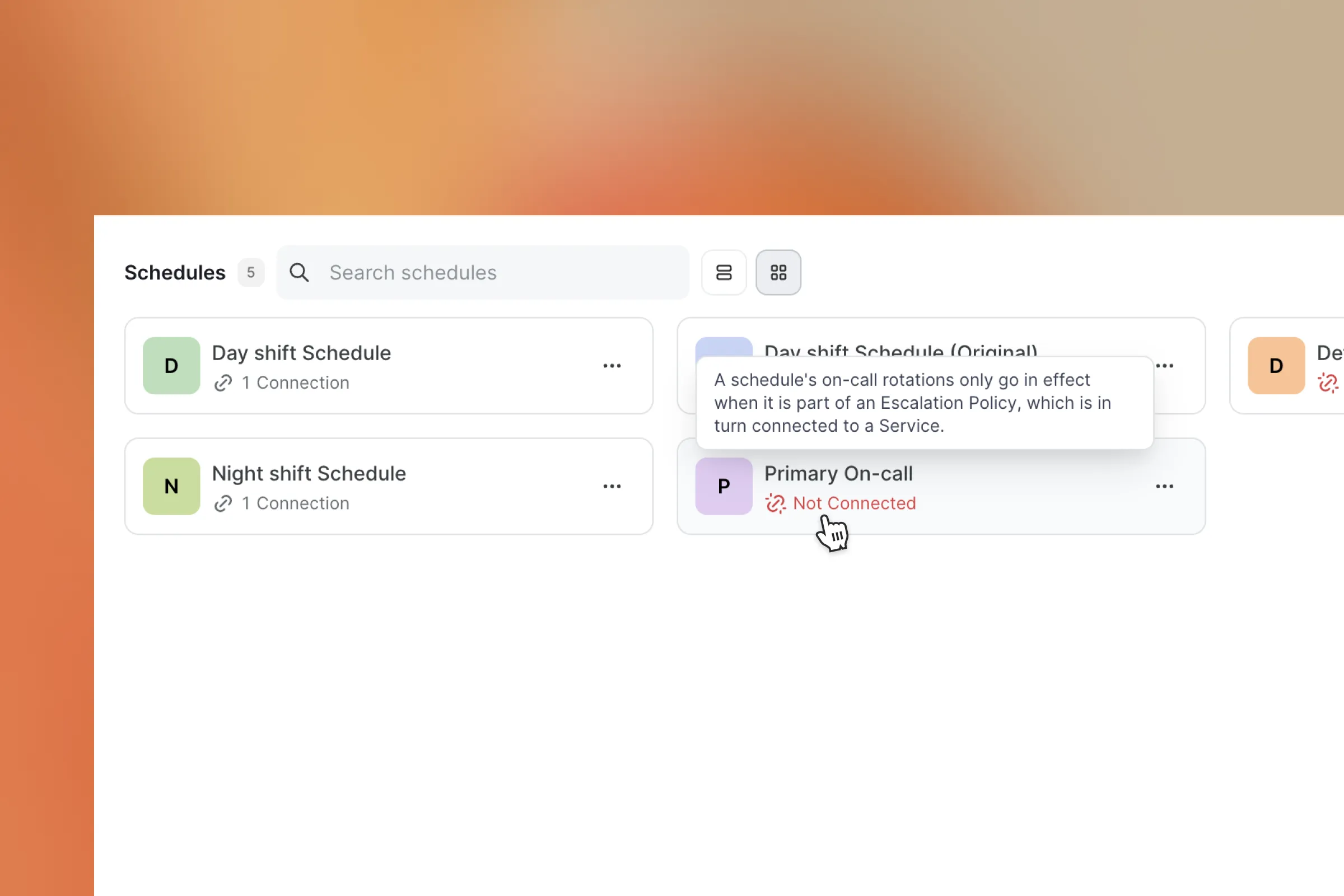
Schedules only take place if one schedule is connected into an escalation policy, thats another part of the team and this escalation policy have to be attached to a service 🤯
Schedule defines OnCall rotation
Attach this schedule to an EP
EP defines the hierarchy for escalations
Attach this EP to a service
Service gets impacted
A User or a User who is oncall from the schedule attached to the EP gets alerted
If they did not acknowledge it escalates to the next level

If the first part is broken then the entire incident management cycle is broken
Chapter six
In the last minute someone will suggest something that makes so much sense but horrible to hear !
In our initial flow we had the save button inside the layer edit panel, make changes on a layer, you save or discard and then move on, that sounded simple safe and logical.
Everybody seems to be okay with this in prototypes and multiple levels of testing. But in the end something lit up for Dheeraj and he questioned a use case of editing multiple layers back to back. And it made so much sense!
Its completely unnecessary to send so much save requests. So we quickly changed the logic and brought the logic to the top. You do all your changes and save it once or whenever you need and move on. You forget to save things ??
We prompt you to save or discard before you make mistake
To make things a bit more easy we brought in keyboard accessibility of Cmd+S to save schedules on the go.
Chapter seven
Improving things and seeing changes
On the error handling side we saw one error being triggered more often than any other one and such moments were crucial to understand and improve things. We saw users triggering an event of not adding users while creating overrides. our first thought of solution was to add auto focus on adding users selection by default and see that created an impact on error rates by 40%
We saw more than 50% improvement in terms of time of creation of layers.

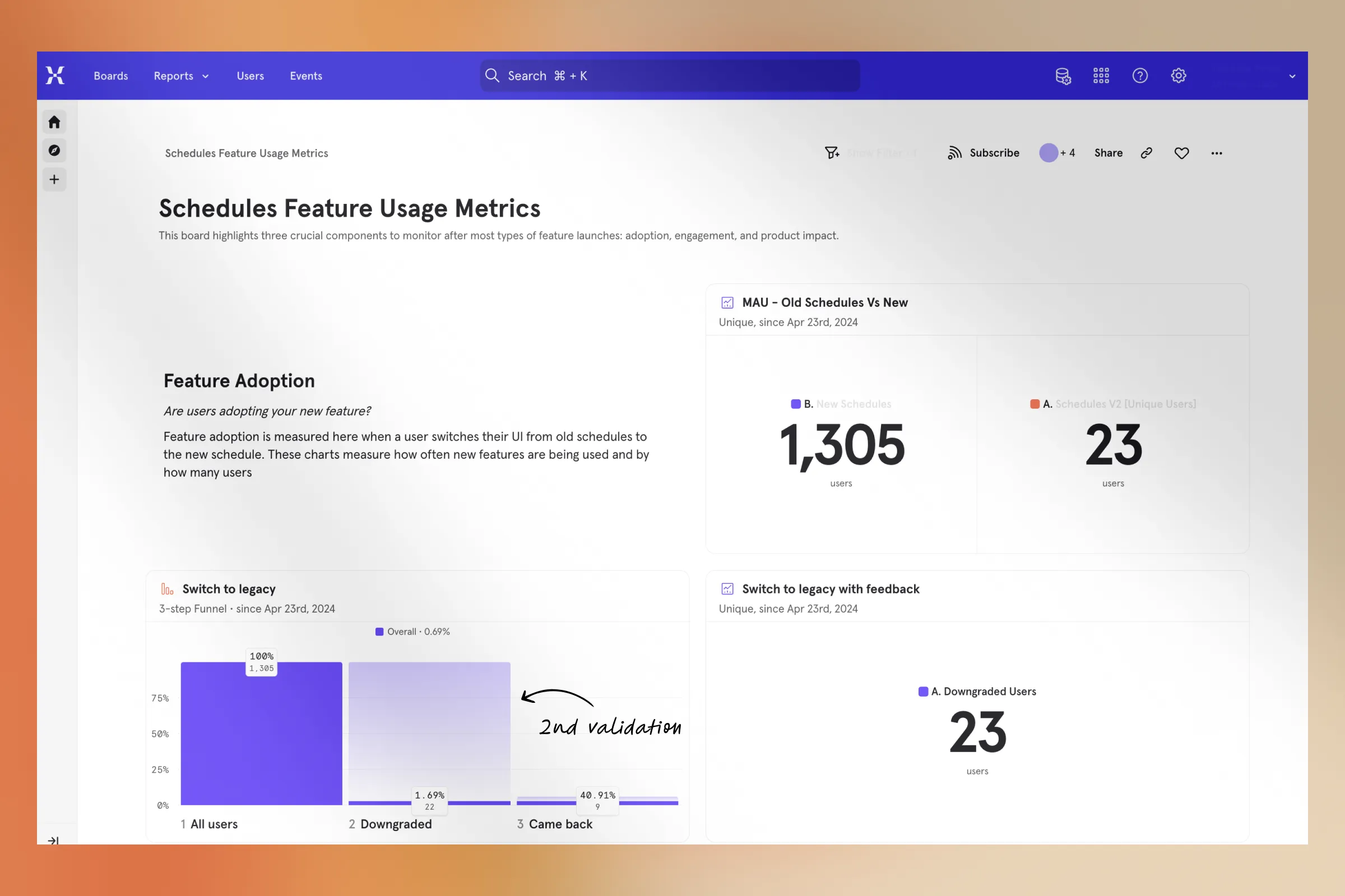
We didn't stop there, we gave an option to go back to the Legacy UI for the users who preferred it but made a step mandatory where they have to give us feedback why they go back so that we can understand and improve the product more.

Till now only 1.69% of our users tried going back to the old UI and 40% of them came back again in a few days reducing the bounce rate to under 0.59% percentage.

Up next
