Cutting 6 Scrolls to One Glance, Where a Wrong Schedule Means Nobody Gets Paged
Area : B2B SaaS, Incident Management, BLR IND
When : 2021 — 2025
Role : Product Designer

TL DR
The preview lived at the bottom of the page, so people saved schedules they had never actually seen. I brought the changes and the proof of those changes into one view. I redesigned the on-call schedule editor so every change and its live preview sit in the same place, instead of a screen you had to scroll up and down to trust. The goal was simple: shrink the gap between making a change and knowing it’s correct, because a wrong schedule means the wrong person gets paged, or nobody does.
Problem
It started with our customer success team. Anjana was heading CS at the time, and the same patterns kept surfacing in tickets: confusion in usability, navigation, and error handling. People came to us asking why they weren’t getting alerts, and the answer was usually the same. They had changed a schedule without ever seeing the preview that sat far below the fold.
Layers
Restrictions
Rotations
Overrides
Preview
Layers
Restrictions
Rotations
Overrides
Preview
How can we let managers see a schedule take shape as they build it, so they trust it before anyone’s pager depends on it?
This became the brief
11,000
Users triggered scroll events on the editor every month
6
Scroll events per user/ action just to confirm a single change
~12/mo
Support conversations that flagged the same confusion


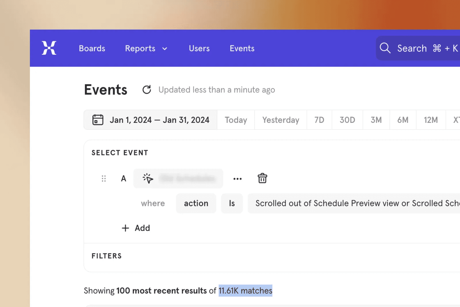
So I tracked user behaviour through event and scroll tracking and sat with the CS team to learn the core workflow, and found out


The preview lived at the bottom, so saved changes was never seen take effect.
Confirming one change in a layer took an average of six scrolls up and down.
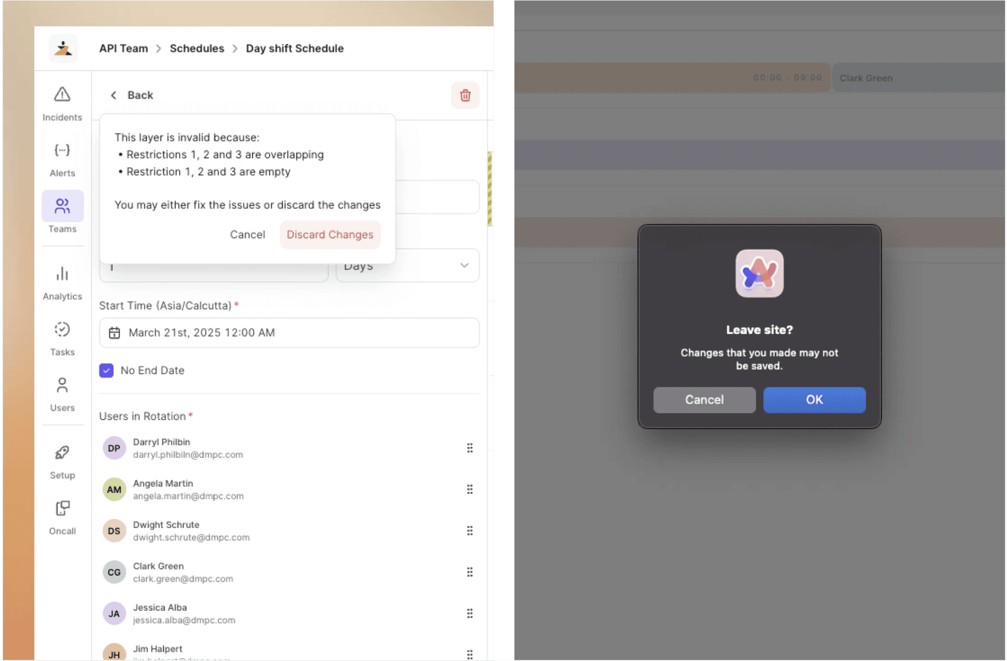
Overlapping restrictions inside a single layer silently produced incorrect schedule data.
When something was wrong, nothing told the user what was wrong or where.
Live preview docked beside the editor, so every change is visible in parallel
Inline validation that points to the exact error and the exact field that caused it.
Save moved out of the layer panel to the top, so you save once after the edit
Accessible date picker for restrictions, with overlap detection built in.
Unsaved-change prompts and accidental-close protection, so no edit is lost
Cmd+S support to save schedules without reaching for the mouse.
Impact from the Design
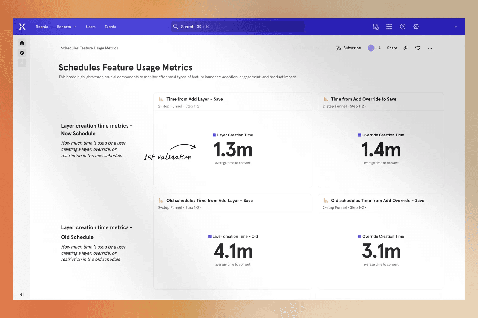
50%
Faster to create a layer or override
40%
Drop in the most common error after auto-focusing the user selection on overrides
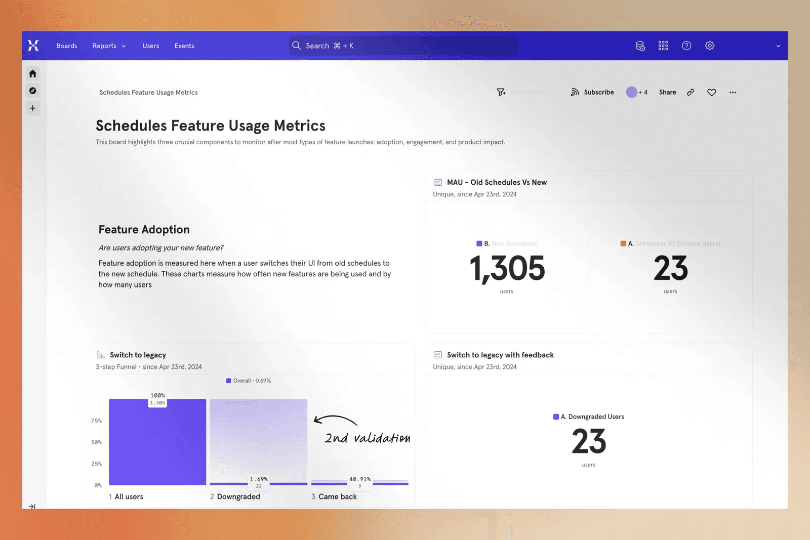
1.69%
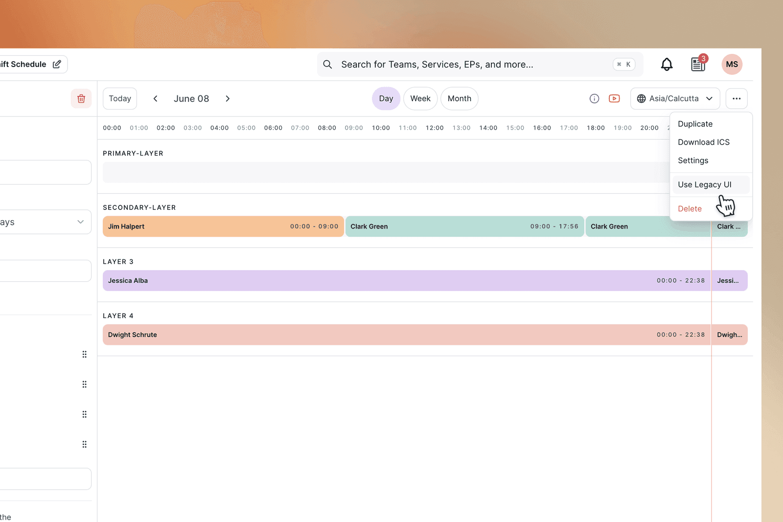
Users who switched back to the legacy UI
0.59%
Final downgrade rate after 40% of them returned
Why this mattered
A schedule is the first link in the alerting chain. It feeds an escalation policy, the policy attaches to a service, and the service decides who gets paged when something breaks. If the schedule is wrong, the page goes to the wrong person or to nobody, and the clock keeps running while the incident does. At a company processing thousands of transactions an hour, a single mis-saved rotation can leave an incident sitting unacknowledged for minutes before it reaches a human. At industry estimates of around \$2,000 per minute of downtime, one broken schedule can cost thousands before anyone notices the page never landed. The hidden preview was never a UI nitpick. It was the difference between a schedule that works and one that fails silently.


